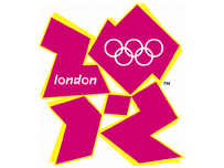
 Here then is the 2012 Olympic logo. A mere snip at £400,000. Ain’t it great to know your money is being spent so wisely? It’s animated too. I believe it is supposed to be a cubist representation of a fat pink and naked John Prescott giving head to a similarly naked Tony Blair.
And presumably, as I live in London, some of my Council Tax went towards paying for it.
My first comment on it (elsewhere) –
Each pink bit represents a pile coming out the ass of the Olympic committee that is the result of them sitting for long periods thinking of new and ever more shit ways to spend other peoples money.
Neal, have you seen the Paraolympic logo? I seriously thought it was a joke. I would like to formally enter it for the Turner prize.
http://www.paralympic.org/release/Main_Sections_Menu/News/Press_Releases/2007_06_04_a.html
-nsfw-
http://img9.imagepile.net/img9/12224olympicgschpunken.gif
that took long didn't it?