Author: Neal Asher
Some Crap Covers
Which Cover?
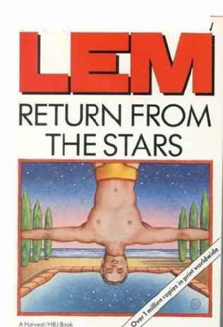
Here’s a couple of question that have come up on Twitter: what kind of cover puts you off a fantasy or science fiction book? I also wonder about the reverse: in both genres, what kind of cover catches your eye and makes you turn the book over to take a look at the blurb, or maybe read a bit of the first page?
Here’s a section from an interview I’m doing now for the Mad Hatter, which seems relevant:
MH: Tor UK has been recently re-releasing many of your books with new cover art, which I must say are usually outstanding. I’ve noticed they’re usually going with some sort of crazy looking monster-alien creature popping off the page. Before I had read The Skinner I thought they’d be a crazy Horror/Sci-Fi mash-up, while they are clearly more than that were you going for a Horror feel at all. Do many of the stories involve monsters of a sort?
Neal Asher: Yes, many of my stories involve monsters, some of which, of course, are human. I don’t think the intention was to go for a horror feel to the books, since the horror market is not exactly in the rude health it was in twenty or so years ago. I think here we have more of a case of unashamed cover design. This is science fiction, this is science fiction with aliens, big guns and weird robots and, no matter what any myopic twits in the publishing industry might think, we are not going to have a still-life cover featuring a rose and a handgun.
MH: I think fans appreciate it. You can only have so many ephemeral space stations and ringed world covers…
And here’s some Facebook replies, fantasy first:
Jesper Krogsgaard: If it’s all light, bright and glamour I usually stay 100 miles away. It has to be at least a bit gritty – unless it’s a comedy.
Colin Strawbridge: Generic ‘bodice ripper’ type pictures are a big turn off.
Stuart McMillan: Heaving bosoms and demure damsels keep my wallet *in* my pocket. Saying that, great chested men with giant weapons are equally a turn-off.
Andy Plumbly: Typical bright colours and a generic character on the front. Saying that….Gridlinked originally caught my eye because of it’s snazzy cover (the green one). Loving all the newer covers of yours too!
And now SF:
Jesper Krogsgaard: Ewoks. Cute and fuzzy. Using conventional pictures doesn’t provide enough mystery unless you twist it. Again, like with fantasy, I like it gritty, dark and dangerous.
Colin Strawbridge: I think the typefaces used are more important than pictures; Gollancz have managed pretty well all these years without resorting to lurid graphics.One thing i find especially disconcerting is when they put celebrity reviewers names in much larger print than the actual author.
What do all you reading this think?
New Brass Man Cover
Mr Sullivan has done the book proud:
St. Leonards' Visit.
Another place we visit at least once a year, ever since being introduced to it by Peter Lavery ten years ago, is St. Leonards-on-Sea and, by foot from there, Hastings itself. In the winter time it is a little bit dreary, but there’s still some excellent stuff to see, and to do. The latter of these usually involve fish and chips and red wine, which we always find we need after first installing ourselves in a fifth floor flat and then tramping for miles up and down various slopes. You have to remember we come from flatland Essex, and we live in a bungalow. My calves are still aching.
Here’s one of the typically Victorian (Edwardian?) streets:
The Jain technology died in this park many years ago, but this remnant remains:
Nobody told Caroline it was a Whomping Willow:
Hastings Pier, a wonderful place where once you could play silly games, buy sickly sweets, stroll out over the sea or sup wine out at a table in the sunshine. Now being left to fall to ruin while the arseholes in the council instead blow money on a modern art gallery no one will visit. The sea air may clear ones head, but doesn’t clear stupidity from the heads of council bureaucrats:
I nice little pub whose name I can’t remember right now. It has everything a pub should have, except cigarette smoke and customers (there’s a connection):
Family History
We took a wander up to Chatteris a week ago, stopped in a pub called The Cross Keys, then sloped back to Soham to do some research into Caroline’s family history. (Of course the latter place is famous for somewhat nastier events than being the breeding ground of the Sizer family. I did wonder about a rather odd look I got when I asked about the location of a particular graveyard) This research generally involved clumping about graveyards checking the names on tombstones, checking the names on a war memorial, then drinking beer and eating bacon and egg baguettes. Here’s a couple of pictures from the area. First off The Cross Keys itself:
Next the well-guarded door to our room:
Caroline’s parents got the better bed!
One of our hunting grounds:
One of our finds (Sizer):
The Fountain – location of those wonderful baguettes, and where we wished we had stayed:
Wonders of the Solar System
I like to think that this was the minimum deal with the Devil Cox could make to ensure he would present the program. I like to think this was the minimum he could say to calm the political demagogues at the BBC so as to enable him to zip off to Africa to experience an English Electric Lightning jet flight straight up at 5 gees to the limits of the atmosphere to observe that ‘thin blue line’, or race across the Namib in a 4×4 to do a small piece about the sands of Mars, or race a speed boat across a lake to gather up some methane whilst talking about Saturn’s moon, Titan.Anyway, I’ll continue watching the program, and just hope that the homilies are out of the way…