Farlander — Col Buchanan

Having attempted to read a couple of fantasy books within the last few months, and having failed, I was beginning to wonder if I was going off fantasy. Those other books felt derivative, laughably serious about what to me seemed plain silly. Maybe I had lost that vital ability to ‘suspend disbelief’ with fantasy? However, reading Col Buchanan’s Farlander I realised that no, I wasn’t going off fantasy, I’d just gone off the stuff that failed to engage me. I would still be able to enjoy something like Alan Campbell’s Scar Night, or anything by Gemmel, or Zelazny, or any number of excellent books I’d read before.

I’m a lot less tolerant nowadays. Life is too short to put up with a book that doesn’t come up with the goods. I know that if I haven’t been hooked within the first few pages it’s unlikely to happen, and if I’m still uninterested by the end of the first chapter it’s time to put the book aside. Two pages in to Farlander I was hooked and a chapter in I knew I wouldn’t be putting it aside.

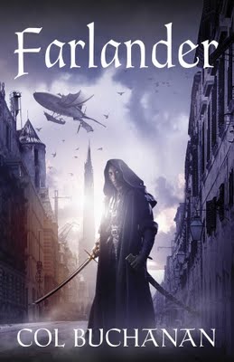
Considering previous discussions about covers here I have to say that the picture on the front was too reminiscent of Star Wars and, when I discovered that the disposable soldiers of the Empire of Mann wore white armour and that the monkish swordsman Ash would be taking on an apprentice, I was a tad dubious. But the writing kept me engaged; kept me wanting to know more. As I continued to read I felt that Buchanan was attracted to fantasy toys, picking them up and giving them a shake, then realising they weren’t good enough for the story he wanted to tell, and discarding them. Throughout this there are scenes, tropes, characters and influences from other works – here a bit of Gene Wolfe’s Shadow of the Torturer, there some definite Gemmel, over there a taste even of Robert E Howard, and as ever a little bit of urban fantasy too – but in the end Buchanan makes them his own.

Farlander is the first book of a series, but reads well enough on its own. I’ll certainly be reading the next book, for I have a feeling that it’s going to be even better. Nice one Mr Buchanan.

Book Piracy

What was it, a few weeks ago I was talking about ebooks, the dangers, whatever? Of course the Internet world moves really fast and now, already, it seems someone is pirating my books. For obvious reasons I won’t make a link to the site concerned. Nice hey. You spend twenty years banging your head against a wall to learn your trade and finally get your book published, you work non-stop to build a career, then some prick thinks it’s quite fine to obtain a copy of your work and give it away. Hey, by all means lend a book to someone, but don’t set up a fucking website to give it away to hundreds of people you don’t even know! I guess the person doing this feels he is being altruistic, that he’s giving a service (which in this case he wants donations for). I feel just like I always feel when someone rips me off; steals my property from me.

Five Book Contract

Damn me, my publisher didn’t change the locks when I popped outside for a cigarette. After four contracts for three books, plus a collection of short stories and two extras first published in America, over a million and a half words having passed under editorial pencils, they’re still not fed up with me. Even after having to tolerate a slightly drunk author wandering around Macmillan offices, snaffling any book that isn’t nailed down and secreting it in a Tesco carrier bag, they’re still prepared to put up with me. Wow!
Now, whilst progressively renewing my covers (using those superb Jon Sullivan pictures), Tor Macmillan have given me a five book contract, which I’ve signed. My last contract underwent a slight redesign with the last two books being swapped around so that The Departure, a novel based on short stories that appeared in my collection The Engineer ReConditioned, will be published last rather than second to last. This book will be the first of the ‘Owner Sequence’ comprising two further books titled Zero Point and Jupiter War. After that I’m signed up for three as yet to be named books, so I’ll certainly be writing books for Macmillan for some years to come.
I see the future now. New employees at Macmillan will express momentary bafflement and surprise, “Neal Asher? I thought he was dead?” whereupon oldtimers will point nervously to a big iron-studded oak door, “We keep him in there”. Neophyte editors will be ushered through that door, “Keep to the right. Do not touch or approach the glass. You pass him nothing but soft paper…” Meanwhile, those working in book shops will check their latest delivery and dubiously eye the sagging ‘A’ shelf. A Hogwarts trained shelf-stacker will remove the books from their box with iron tongues, whilst a second employee affixes the chains.
Thanks all at Macmillan, it’s great working with you.
If anyone has any press queries, please email cdothealyatmacmillandotcodotuk 

Science Fiction Covers

And now to science fiction. Rather than try to sort this lot out, I’ll leave them to speak for themselves, bearing in mind that these are responses to the question ‘What sort of cover puts you off an SF book?’:

Jesper Krogsgaard: Ewoks. Cute and fuzzy. Using conventional pictures doesn’t provide enough mystery unless you twist it. Again, like with fantasy, I like it gritty, dark and dangerous.
Colin Strawbridge: I think the typefaces used are more important than pictures; Gollancz have managed pretty well all these years without resorting to lurid graphics.One thing i find especially disconcerting is when they put celebrity reviewers names in much larger print than the actual author.
Andy Plumbly: Something that seems totally irrelevant to sci-fi. Like an apple. I’m quite happy with a spaceship or planet. Simple mind I guess.
Colin Strawbridge: I love how what on initial inspection seems like a random picture eventually starts to make sense as one gets further into the book.
Peter Nugent: Something original. If it’s the bog standard hero with a smoking gun on an alien landscape that looks suspiciously like a desert i’m usually not interested.
Bob Lock: Squids in spacesuits…
Stuart McMillan: Complicated scenes and complicated fonts. Keep It Simple, Stupid (KISS) principles must apply.
Jon Bodan: On further reflection, I think that if you had the book name in the Tron font, and your name in the mid-80s digital font, it would be ace. Lol
Roger Fourt: Winners: M M Smith, Jeff Noon, Asher (I wouldn’t lie)
Losers: Hamilton, Reynolds, Morgan.
Simple premise: avoid badly painted unfeasibly large spaceships.
Susan Hopkins Carpenter: I agree with Stuart, simple generally works best for me too. What puts me off is something too esoteric, I just know I’m going to be wading through pretentions claptrap.
Zeon D V Kitchiner: Anything with gold embossed lettering and roses.
Dave Wells: I find it’s normally something on the cover that catches my eye which then prompts me to read the synopsis etc rather than anything specific putting me off. Course if it has ASHER on it then I pick it up just to have a look even though I’ve already got all of your books 🙂
Chuck McKenzie: Cartoony spaceships.
Owen Roberts: Depictions of characters.

Salamander.

Here’s a little note from Petr Kotrle my Czech tranlator:

Before you leave for your summer home again, I’d like to tell you that your book was shortlisted for the Czech SF&F&H Academy Award again, this time The Voyage of the Sable Keech (The other titles in SF are David Marusek: Counting Heads, Ian McDonald: River of Gods, China Miéville: The City & the City, Vladimir Sorokin: Day of the Oprichnik).

The Skinner won this award a while back and Gridlinked was shortlisted the following year. The picture here is the boss of the Czech publisher collecting the first.

Gridlinked Film.

And the last post reminds me of this, unearthed from deep in this blog where posts are fossilizing, I was an angrier man, the world had less shades of grey, ad nauseum…

Cameron Dadd is an eighteen-year-old freelance graphic designer who lives in the most isolated city on our planet. He does have a small collection, but it’s as yet unavailable online, however, there’s Leviathan here: http://sharpendofreason.deviantart.com/ which, inspired by Cameron’s work, was created by a good friend of his called Carlo – looks like something Dragon put together!

(Of course Cameron is no longer 18, and who knows if this website is still current)

Fantasy Covers

Here’s a little summation of just a few opinions about fantasy covers. Some hardened SF readers simply don’t want to know, an opinion summed up by Roger Fourt: Anyone wielding shiny sacred weapons, multiple planets/moons in the background, improbable waterfalls, ludicrous cities perched atop unscalable peaks. In fact, fantasy covers are generally off-putting, along with their trite, largely write-by-numbers storylines and nerdy pubescant D&D followers. Gives SF a bad rap by association.
Those that do want to know object to depictions that bear either little relation to what the books contains, or are, frankly, embarrassing. On covers Bob Lock doesn’t like fairies, or the WOT series as all the characters seem not to scale. They look as if they are riding Shetland ponies, nothing like how I imagined them from their descriptions, whilst Stuart McMillan opines, heaving bosoms and demure damsels keep my wallet *in* my pocket. Saying that, great chested men with giant weapons are equally a turn-off. Andy Plumbly and Chuck MacKenzie respectively don’t like the typical bright colours and a generic character on the front and ‘same old’ sword & sandals designs (think the ‘Gor’ books).
And then Andi Marment and Chuck lean towards fantasy down and dirty like weaveworld or imagica, none of that wheel of time bobbins or fantasy books (athough I read very little fantasy) with cities on the cover, but that’s largely due to having read brilliant ‘city’ fantasies by China Mieville and Alan Campbell.
So what can be learned from all this? What some like and dislike about a cover is usually informed by their opinion of what is inside the book. In the end, making an exception of those embarrassed about their ‘guilty pleasure’, the truer the cover is to the book’s contents the better. But then we all knew that anyway.
Of course, the sample of opinions here doesn’t mean a lot. What would all those 10 to 18 year old boys think of the John Norman cover here? I certainly still like the lurid covers on some of my books and, had I avoided such covers, my reading, and enjoyable reading, throughout my life would have been cut down by about 80%.  

Which Cover?

Here’s a couple of question that have come up on Twitter: what kind of cover puts you off a fantasy or science fiction book? I also wonder about the reverse: in both genres, what kind of cover catches your eye and makes you turn the book over to take a look at the blurb, or maybe read a bit of the first page?

Here’s a section from an interview I’m doing now for the Mad Hatter, which seems relevant:

MH: Tor UK has been recently re-releasing many of your books with new cover art, which I must say are usually outstanding. I’ve noticed they’re usually going with some sort of crazy looking monster-alien creature popping off the page. Before I had read The Skinner I thought they’d be a crazy Horror/Sci-Fi mash-up, while they are clearly more than that were you going for a Horror feel at all. Do many of the stories involve monsters of a sort?


Neal Asher: Yes, many of my stories involve monsters, some of which, of course, are human. I don’t think the intention was to go for a horror feel to the books, since the horror market is not exactly in the rude health it was in twenty or so years ago. I think here we have more of a case of unashamed cover design. This is science fiction, this is science fiction with aliens, big guns and weird robots and, no matter what any myopic twits in the publishing industry might think, we are not going to have a still-life cover featuring a rose and a handgun.


MH: I think fans appreciate it. You can only have so many ephemeral space stations and ringed world covers…

And here’s some Facebook replies, fantasy first:

Jesper Krogsgaard: If it’s all light, bright and glamour I usually stay 100 miles away. It has to be at least a bit gritty – unless it’s a comedy.

Colin Strawbridge: Generic ‘bodice ripper’ type pictures are a big turn off.


Stuart McMillan: Heaving bosoms and demure damsels keep my wallet *in* my pocket. Saying that, great chested men with giant weapons are equally a turn-off.


Andy Plumbly: Typical bright colours and a generic character on the front. Saying that….Gridlinked originally caught my eye because of it’s snazzy cover (the green one). Loving all the newer covers of yours too!

And now SF:


Jesper Krogsgaard: Ewoks. Cute and fuzzy. Using conventional pictures doesn’t provide enough mystery unless you twist it. Again, like with fantasy, I like it gritty, dark and dangerous.

Colin Strawbridge: I think the typefaces used are more important than pictures; Gollancz have managed pretty well all these years without resorting to lurid graphics.One thing i find especially disconcerting is when they put celebrity reviewers names in much larger print than the actual author.

What do all you reading this think?